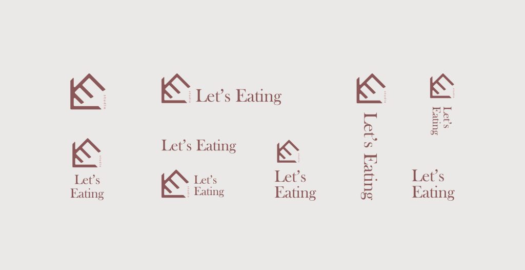
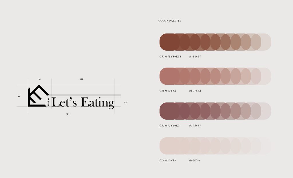
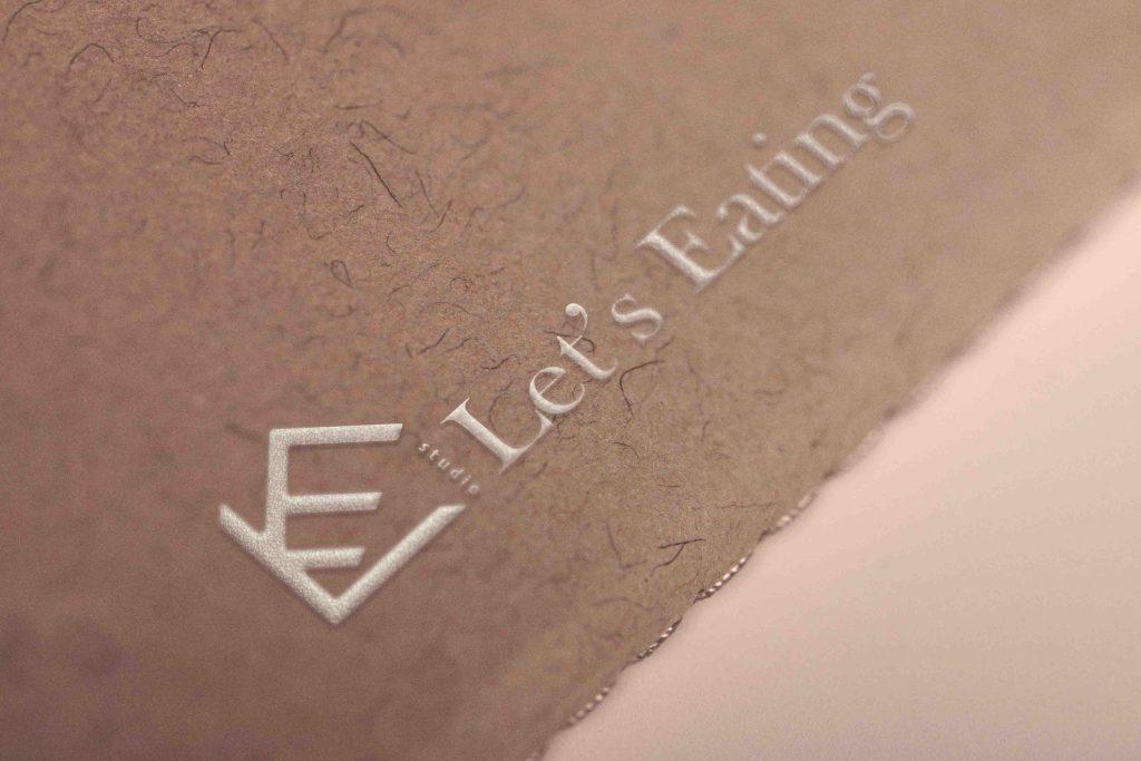
This logo design is inspired by the concept of a house, creatively integrating the letters “L” and “E” into an abstract graphic that enhances the brand’s identity. The color palette is centered around a warm, wood-toned red, paired with an elegant serif font to evoke a refined atmosphere, perfectly capturing the essence of exquisite desserts.
このロゴデザインは、家をイメージしたコンセプトを基に、アルファベット「L」と「E」を巧みに組み合わせた抽象的な図形でブランドのアイデンティティを表現しています。色調は温かみのある木質系の赤を基調とし、洗練されたセリフ体のフォントを組み合わせることで、高級感と上質なスイーツの雰囲気を見事に演出しています。